Why Care About eCommerce UX-UI?
As an eCommerce owner, you are unnecessarily aware of the fact that when visitors first land on your website, hardly they read every single line. They scan and skim instead. If they are quickly fed with the keywords or images they want or they find interesting, they stay. Otherwise, they simply switch to your competitors’ online stores. Leaving or staying on a web page is then a matter of seconds, or even milliseconds (0.05 seconds to be exact).
At this point, what we are talking about are website user experience (UX) and user interface (UI). To website visitors, these terms mean respectively how a website interacts with them and the way it looks. To eCommerce owners, they mean much less abstractly: conversion rate optimization. But what’s more, a better UX could also help save a great deal on customer support cost, customer acquisition cost, while maximizing the probability that purchases are repeated.
Good news is that you don’t have to work it out by gut-feeling. Below is a mini-guide consisting of tried-and-true practices recommended by our UX-UI designers at Enable Startup, based on their over 8 years of experience with tens of eCommerce projects. Let’s get started!
1. Make your eCommerce platform mobile-friendly
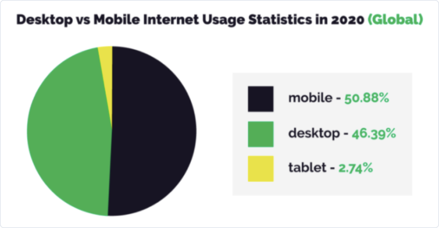
With more than 50% of all internet traffic today shopping from a mobile device, the importance of mobile friendliness in eCommerce website design and development is no longer for discussion.
The question that really matters now is HOW?
There is a long list of things needed to work out, mostly related to the way text and visual elements display on different screen sizes, devices’ capabilities, features, and most importantly different associated user behaviors across devices. For eCommerce particularly, the main mobile devices in question are smartphones and tablets.
Below we list down the most fundamental tasks and tips to help you obtain an eCommerce website that performs on whatever device.
1.1. Transfer your website design to a responsive layout
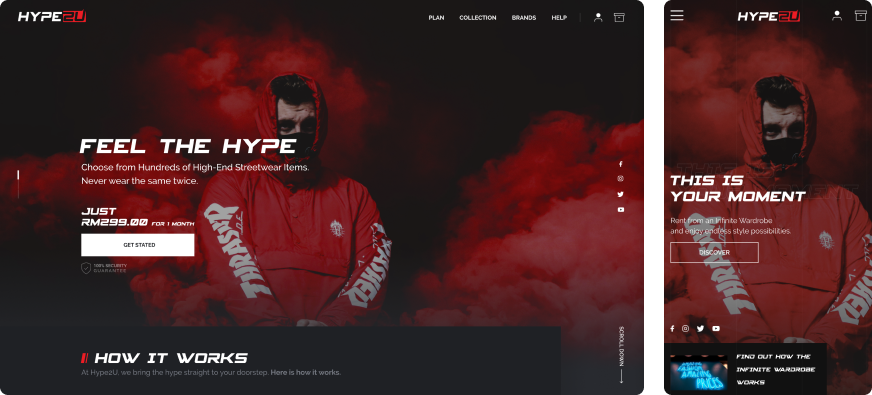
Responsive web design is becoming almost a must today. In short, it’s the job of making the site automatically adaptive to the device on which it’s viewed. This could be done by certain tactics such as adding media queries to the HTML codes, working on medias, typography and other visual elements of the website.
Therefore it’s important to check with your agency upfront whether a responsive design layout is included in their scope of work. At Enable Startup, we offer this to clients by default.
1.2. Optimize the page load speed (preferably no more than 3 seconds)
Believe it or not, in eCommerce, one second might cost you a fortune. For Amazon, this fortune could be $1.6 billion in sales each year, while in the case of Google, the loss equals to 10 million searches per day.
Thoughtful designers would handle this concern by making the look tasteful yet simply and light enough, using compressed images or minimizing custom fonts. Whereas skilled developers would strive for high quality code.
It would be ideal if you are capable of controlling all of those technical reasons behind your website load speed yourself. Otherwise, the least things you can do are:
- Check this metric using free tools like Pingdom, Google PageSpeed Insights, GTMetrix , etc.
- If the result is larger than 3 seconds, just ask your web design team for solutions.
1.3. Make sure content is consistent and text is readable from device to device
It’s not complicated to figure this point out, isn’t it?
There are still some concrete practices and insights that you can consider though:
- Short headlines work better (preferably fewer than 6 words)
- For the long text, chunk it in sections and make use of spacing. There should be between 30 and 40 characters to a line.
- Try to avoid italics, cursive and decorative fonts. For the highlight purpose, use bolding, coloring and large font sizes instead.
- The most important thing: make sure every text is meant to drive readers to some concrete action.
1.4. Be careful with pop-ups
Pop-ups could be helpful in many cases. However, on mobile devices, they should be used very sensibly. One of the major reasons is that Google tends to deprioritizing sites that utilize intrusive, unsolicited modals (i.e. partially covering popups and other types of intrusive interstitials) on mobile. But that’s not all. Such modals are also found to be the ad technique that mobile users hate the most, according to Nielsen Norman Group.
This is not to say you have to entirely say no to popups on mobile devices. Just make sure they are used for a reason that is convincingly user-centric.
1.5. Streamline the navigation, it should remain simple and straightforward
The reasons are pretty simple. First, mobile screens are small. Second, mobile users are often on the go and they don’t like to wait. Finally, 75% of people use only one thumb to interact with their screen.
The rule of thumb here is to keep the most important elements within reach. For eCommerce sites, usually they are features like search, check out, add to cart. The use of sticky footer and header is highly recommended to serve this job.
Last but not least, check if various technical elements (e.g. product purchase or form completion) function correctly and seamlessly on the mobile devices in question.
2. Adopt a Clean & Focused Design
A go-to eCommerce UI design should make people engage before making them feel beautiful.
It’s no secret that minimum is better here, since it helps minimize distractions, putting the spotlight on the products and desired call-to-actions, thereby shortening customers’ purchase decision making.
No matter how we at Enable Startup are in love with cool graphics and artistic stuff, what we recommend to our clients in most eCommerce UX-UI design projects is a clean, light, neat and easy-to-digest style, as we know it helps them reach to wider audience and, yes, sell better.
Even when the chosen style is not really minimalist, make sure that every visual element is used on purpose.
For a layman to UI design, the trickiest thing is sometimes not to distinguish between a good and a bad layout, but how to explain to designers why it is not good enough. A good question to ask your designers every time you feel something wrong is “why do you use this element here and this way?” A proficient designer should give you the answers that make sense. Otherwise, just request a solution that makes more sense.
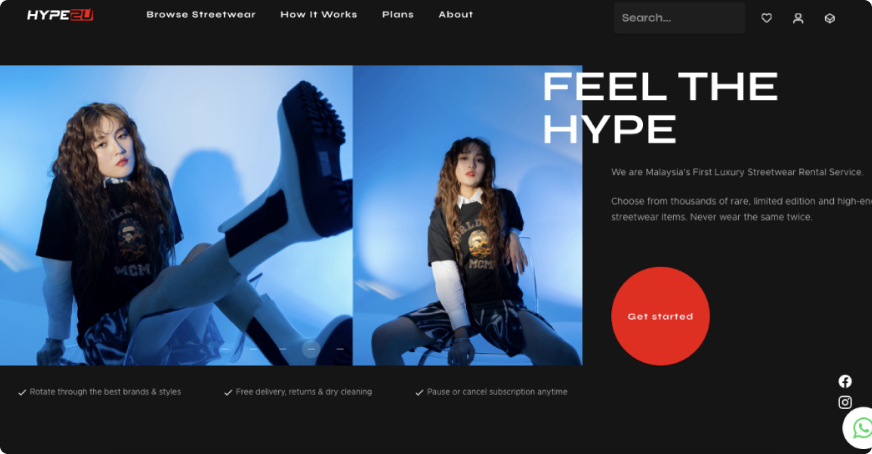
Now, let's move to the part 2 of the article to unbox more best practices!
Best practices for eCommerce UX-UI Design - Part 2
3. Create an Easy-to-use Navigation
- The Menu Bar
- The Mega Menu
- The Search Box
- The Filters and Sorting
4. Simplify your Checkout Process
You can implement these practices on your website by yourselves or contact us at [email protected] to consult our designers, who have lived and breathed UX-UI for years. We will be working out a perfectly unique UI/UX solution tailored to the specific needs and characteristics of your project.


