

Why Care About eCommerce UX-UI?
As an eCommerce owner, you are unnecessarily aware of the fact that when visitors first land on your website, hardly they read every single line. They scan and skim instead. If they are quickly fed with the keywords or images they want or they find interesting, they stay. Otherwise, they simply switch to your competitors’ online stores. Leaving or staying on a web page is then a matter of seconds, or even milliseconds (0.05 seconds to be exact).
At this point, what we are talking about are website user experience (UX) and user interface (UI). To website visitors, these terms mean respectively how a website interacts with them and the way it looks. To eCommerce owners, they mean much less abstractly: conversion rate optimization. But what’s more, a better UX could also help save a great deal on customer support cost, customer acquisition cost, while maximizing the probability that purchases are repeated.
Good news is that you don’t have to work it out by gut-feeling. Below is a mini-guide consisting of tried-and-true practices recommended by our UX-UI designers at Enable Startup, based on their over 8 years of experience with tens of eCommerce projects. Let’s get started!
Read the Part 1 - Make your eCommerce platform mobile-friendly & Adopt a Clean & Focused Design
3. Create an Easy-to-use Navigation
With more than 50% of all internet traffic today shopping from a mobile device, the importance of mobile friendliness in eCommerce website design and development is no longer for discussion.
A poorly-designed navigation structure could ruin all your efforts to recruit traffic in a matter of seconds, since the guest would find no clue on how to locate desired products or whether they are available or not. They leave and would be unlikely to come back.
So, we all agree that website navigation is definitely worth investing in. Now, how?
Let’s go through some of the UX essentials for your e-commerce navigation architecture, including Menu bar, Mega Menu,Search box, Filters and Sorting, as well as some additional elements that you could take into consideration.
3.1. The Menu Bar
The idea is that the menu should be streamlined in such a way that allows users to make as few clicks as possible towards their desired products.
How few should it be? Usually, all web pages should be within 4 clicks from the homepage.
Don’t forget to label the categories and subcategories clearly and easy-to-understand with common sense.
Next question: How many items should be included in the menu bar? Seven is a golden number here. This proven practice was proposed for the first time by George A. Miller, as he stated that normal human short-term memory can afford to remember a maximum of seven items from a list.
It’s important to keep the menu bar accessible from anywhere in the guest’s journey. This can be made possible by using a sticky menu bar or at least making the menu bar appear when the user hovers over the header area with the cursor.
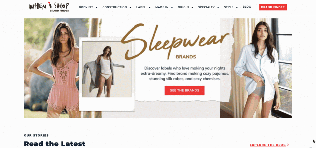
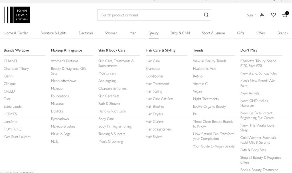
3.2. The Mega Menu
Mega menu could be a super powerful practice to facilitate users to get an idea about what you sell and locate items in handy, especially when you have plenty of products.
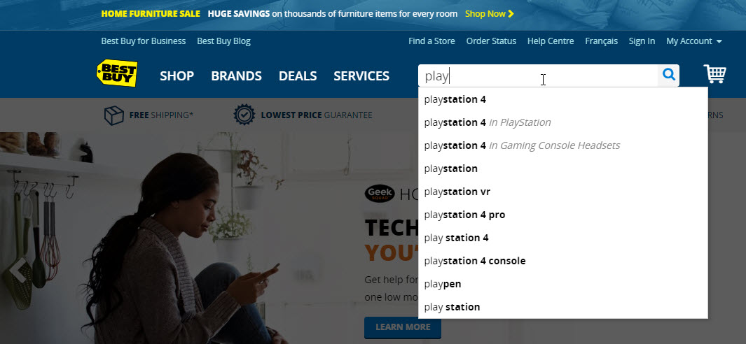
3.3. The Search Box
Broadly speaking, there are two types of online shoppers in this world: those who do window-shopping and those who shop with a specific intent in mind. The prior usually scrolls across your sites spontaneously, while the latter would rely on the search box, filters and sorting feature.
We’ll talk about the Search feature first. According to behavioral studies from the Nielsen Group and other research, more than a half of people when landing on a website go straight to the internal search box in order to navigate.
To optimize this small yet powerful box for them, here are several tips:
- Place the search function at a visible spot on your website header and make it accessible from any page as well as from any point on each page (by using sticky header);
- Make use of the dynamic AI-powered substitution function for search results based on queries entered by users;
- Make the search work for not only products’ exact names but also products’ theme (e.g. summer dress), type (e.g. waterproof coat) and much more. Here you need to brainstorm out of as many as possible ways people refer to certain products.
- Never allow site search to show nothing! Even if there’s no exact-match result is found, show them some similar products for example to give the guest some clues to take further actions.
3.4. The Filters and Sorting
Done well, filters can help shoppers sift through thousands of products and zero in on the ones they are looking for. This is one of the most helpful tools to help minimize the number of steps it takes for customers to find out their desired items, thereby shortening their purchase decision making and improving their satisfaction.
Let’s say the user is served with a result page after entering a search query. Then where should the filtering icon appear?
Basically the two most common options are putting it as a left sidebar or aligning it horizontally above the results. We’d say the latter is a better choice for the following reasons: it allows utilizing the full page width, it is not affected as the user scrolls, last but not least it is much more mobile-friendly compared to the left-hand alternative.
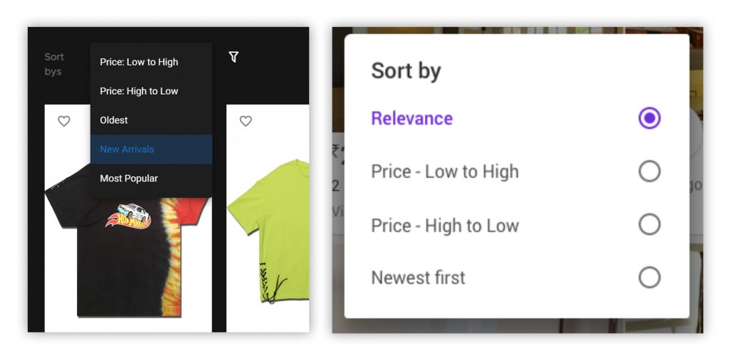
While filtering is for the purpose of narrowing down the number of results, sorting, on the other hand, is to order them according to searchers’ priorities. For example, a price-sensitive shopper may choose to sort the listing from cheapest to most expensive; while a trend-follower may like to see the best-seller items first.
Sort-by options can be presented using radio buttons or dropdown boxes. The most major difference is that the use of radio buttons allows all the options displayed at once, while the dropdown box would only reveal all when the user clicks. Therefore, as a rough guide, a dropdown box is favored if there are four or more sort-by options. Otherwise, opt for the other.
One last tactic to optimize your e-commerce website navigation is using breadcrumbs. This practice would help users on top of the website’s hierarchical structure and easily return to the positions they want, thus expanding the search field.
4. Simplify your Checkout Process
Once your guests have been converted to this very last stage, never let them abandon their shopping carts just because of a cumbersome and annoying checkout process.
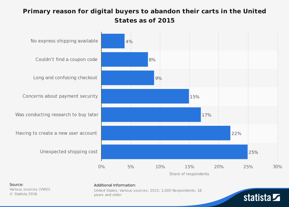
It’s crucial to know at the first place what may cause an online to exit in the middle of their purchase.
According to Statista, among top reasons found, there are two that speak directly to UX, including “long and confusing checkout” and “having to create a new user account”.
The fact is, the more steps customers need to take to buy a product, the less likely they are to make it. A simplified checkout process is thus one of the most well-known practices in e-Commerce UX design.
Ideally, try to wrap your checkout page around the following components:
- Checkout: Consider offering a guest checkout option or allow social sign-in, thereby avoiding forced registration, which is one of customers’ most hated tasks.
- Delivery details: Try to implement the address auto-fill and real-time validating features.
- Payment details: Offer multiple payment options
- Confirmation: Summarize cart contents and order details
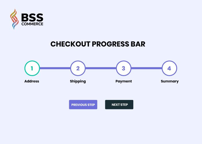
One last point for the checkout process design, it is highly recommended to use clear progress indicators, as in the example below.
Summary
It’s long yet full of new things to learn, isn’t it?
We have just walked through key principles to craft a good UX-UI design for your e-Commerce website. We have tried not to overload this article with unnecessary details, telling you just things that influence the result most profoundly.
You can implement these practices on your website by yourselves or contact us at [email protected] to consult our designers, who have lived and breathed UX-UI for years. We will be working out a perfectly unique UI/UX solution tailored to the specific needs and characteristics of your project.